|
During the past several weeks, Johannes gave detailed descriptions of Basic Design courses. Here, after some final thoughts, the essay returns to philosophical topics - aesthetics. (NINTH of eleven sections)  I. Basic Design within the Foundation Program Within the Foundation Program the two semesters of Basic Design are by themselves a compact summary of an artist’s purely visual work of form and color, as opposed to figure or landscape drawing. Apart from the special mission of three-dimensional composing, the Surface Designs divide the language of their visual domains very carefully into the parts of art and gradually join them toward a plane of competence where the student will be no longer a beginner. To summarize the tasks of a two-semester Basic Design course: Basic Design I:
J. Historical Study 1. Artists need a grounding in Art History to see how cultural excellence – due to causes that fundamentally can never vary – appears in every period and all kinds of places.
2. Besides needing the History of Art to train their eyes at discerning other workers’ best creations – regardless of how unfamiliar may be the face they wear – artists want this study, as every man must want the history of his own kind, for the assuring companionship it offers.
There is no time for me to treat in our framework any useful portion of the History of Art. But we can deal here with the major steps in the development of Western Writing, whose dual heights of excellence must substitute for the miraculous abundance of the history of art which, alas, at present, poses an unwieldy horn of plenty. 1. Our Alphabet is the lineal descendant of Phoenician characters, which are thought to go back to Egyptian pictographs, or to have been independently contrived in Phoenicia. Aleph the bull became Alpha and “A,” Beth – the house, Beta and “B,” Gimel – the camel, Gamma and “G,” so that our word “Alphabet” itself is of this North Semitic origin. 2. Pictographs are unevenly exact sound-alikes. A picture of a deer could do duty for addressing some we are fond of, as in “my dear” and, less precisely, a “gull” as in seagull might mean a “girl.” When Aleph, Beth and Gimel turned into Hellenic Alpha, Beta, and Gamma, their names became mere pronunciation keys for the initial sound and the Phoenician meanings disappeared. Along the way the pictographs grew simpler and more geometric in design, and so became true letters. 3. Around 200 BC, ill-crafted linear letter skeletons, more of a Latin than of Greek appearance, assumed truly geometric character in the centered horizontal bar of “A” and the semi-circles of “C, D, S and R.” The geometric character since then has been preserved, but was modified correctively to give aesthetic satisfaction. These changes produced in A.D. 100 the Monumental Stone-Carved Roman Capital, with the thicks and thins, as well as serifs of our present day. 4. The monumental Roman Capital is the first of two lettering masterpieces we have in Western Europe.
 5. I am indebted here a second time to John Howard Benson – who was the greatest writing master this country ever had – for my brief history of lettering. In his understanding, Chancery Cursive is the finest possible compromise between the needs of the reading eye and our rapidly writing hand. 6. Should we venture, perhaps rashly, to design an alphabet of our own, we must consider this historic line in order to remain inside the bounds of legibility.
If we paint and draw still lifes, landscapes, or the human face and figure and think that lettering can teach us nothing, then we are not true students of the arts we practice. For an excellence a little off-side of our personal striving allows us to dismiss for a while our own designs and can refresh our fatigued and clouded minds, thus crystallizing our judgment and brightening our vision. To perceive in other disciplines how he may improve within his own, characterizes the ardent student and true learner. III The Likeness of a Beautiful Thing A. Two Questions You owe this portion of the series to a one-time student who wrote me letters with questions about art to which I replied in essay form. One exchange dealt with the theme: “Why do we make art?” Two questions reside within the one:
Both of these are philosophical concerns, and a philosophic bent of mind will help us to consider them. But philosophic learning all alone cannot succeed, because the task requires also the experience of a working artist. Because of this, my discourse will not be exclusively a set of philosophical reflections, nor center only on artistic action. But, giving both their due, we may achieve right understanding and thus reveal most clearly what an artist will find proper and worthwhile to do. B. The Meaning of the Term “Art” Art is a strange word, not for what it means, but what it fails to mean.
In the great puzzles of existence, groping in the dark may be common in Philosophy. But otherwise, so much groping in the dark is not altogether usual, because language strives for our understanding, and not to deepen the confusion. For example, “lawnmower” and “dishwasher” proclaim at once what these appliances are and the service they deliver. My task is to make as precisely clear what art is and it does for us, as the names lawnmower and dishwasher make clear the function of those objects. To make as clear, however, does not mean to state as briefly. On the contrary, I must, to some degree, become substantially long-winded. C. The Claim Implied through Showing Art
rich reward.
  Comment:
Has some other discipline offered you insight into the practice or appreciation of visual art?
0 Comments
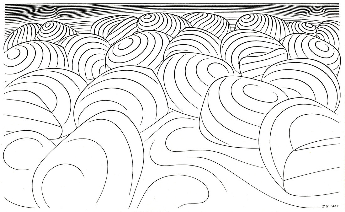
Middle of Essay – Illustrated section on Basic Design, 3rd of 4 Segments The reader may consider the current long, illustrated section to be a digression. Johannes describes courses for Basic Design in the Visual Arts suitable for both art students and those in other fields of study. After these 4 Segments the Essay returns to more general discussion of art education and art theory. Rather than omit this section, it is included as part of the original essay.  6. Detail and Mass: We grasp readily how spherical sections derived from the latitudes and longitudes of the globe render its form legibly and clearly. But any pattern may be altered to conform to any surfaces. For the most complex configurations do only three things against the perspective grids we can inscribe upon all forms:
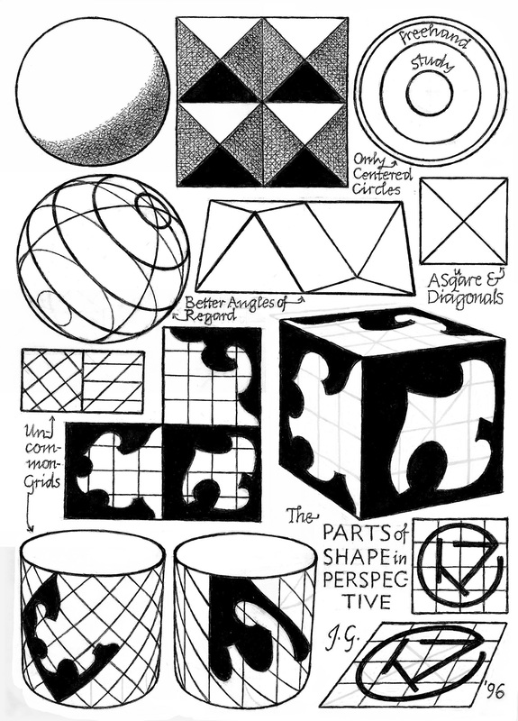 6. Detail and Mass (cont’d)
Since the limits of a shape configuration are linear, suitable line elements – as my human profile shows – can render form as readily as solid areas. 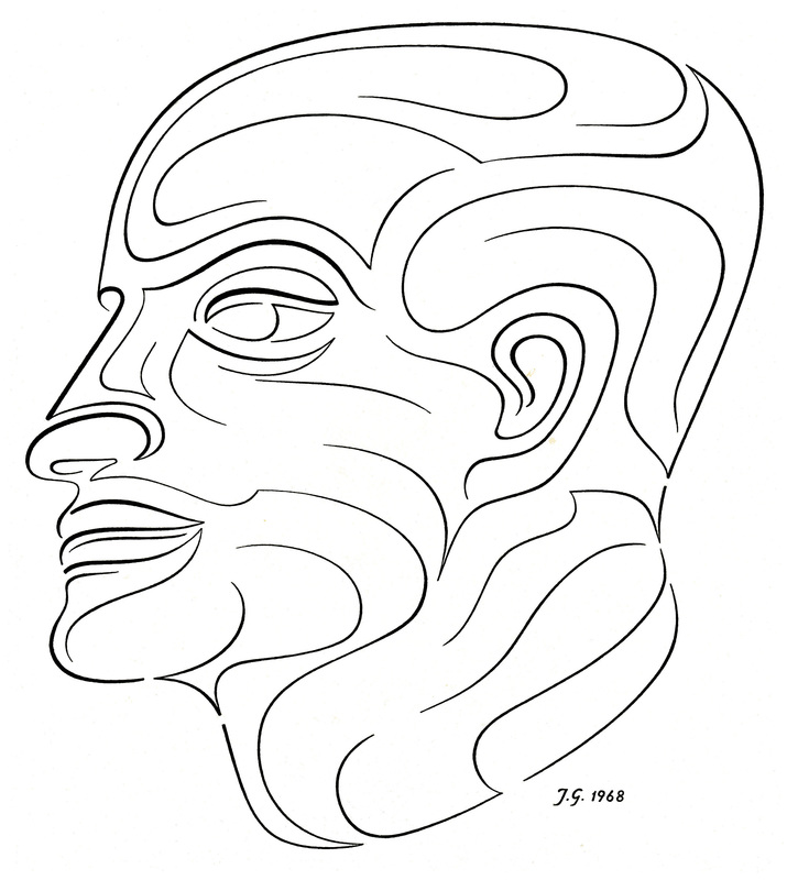 6. Detail and Mass (cont’d)
 6. Detail and Mass (cont’d)
  Middle of Essay – Illustrated section on Basic Design, divided into 4 Segments. The reader may consider the next long, illustrated section to be a digression. Johannes describes courses for Basic Design in the Visual Arts suitable for both art students and those in other fields of study. After these 4 Segments the Essay returns to more general discussion of art education and art theory. Rather than omit this section, it is included as part of the original essay.  II The Transmission of Knowledge (cont'd) F. The Basic Designs
But I have never taught this demanding discipline of composition whose results must give satisfaction from all angles, and I therefore hold no views about which inclusions – in what order – provide the best instruction For Three-Dimensional Design. 2. Two Dimensional Design:
G. Two-Dimensional Design, First Term A study with the aim of constituting the enabling fundament of all the labors of the colorist and draftsman is an ambitious plan. But Basic Design will either be of basic value to the wider tasks of art or else becomes a detour and superfluous delay. Yet our beginning will be unpretending and extremely simple. Two-Dimensional Design, First Term, is pursued with least expensive materials and tools, but is capable of covering the widest range of visual learning.
 2. The Work in Color falls into Two Divisions:
3. Similarly there are visual illusions by which straight lines seem to bend and parallels both to spread and to converge. Thus, to correct unwanted optical effects, the work I show is always done freehand. For even the boundaries of solid shapes are subject to this fooling of the eye. Both the color and the line visual effects follow a familiar rule: If we eat a spoon of honey and then bite into an orange, in comparison with that sweet predecessor, the orange will taste sour as a lemon. 4. My second great teacher, Josef Albers, deserves mention here. From him stem the Color Change and other valuable color demonstrations, as well as one signal tenet of visual expression, of which the following example will give you an idea – though its specific form is mine: “When you draw a profile portrait,” he might say, “give to me the person – not the skull in back – but the identifying features to the front!” This means that off-theme emphasis can be as damaging to pictures as it would be misleading in the spoken tongue.
 4. Composition rules (cont’d)
5. My composition course is a melding of two minds, Albers’ and mine.
 5. More on Composition rules (cont’d) The viewer re-compounds the unity of a design by his own sustained attention to it. A coherence without character – that is, without each part contributing its own unmistakable identity – will suffer, despite its blameless unity, a twofold damage of distraction. One will be the boredom of the viewer and the other, in any exhibition, the powerful attraction of competing better works. Any person – perhaps not himself an artist but seeking practical experience to help him look at art with a sharper vision – might profit from this First Semester of Design. For its manageable, rather simple, technical demands recommend the course not only to beginners but also to the amateur and layman. But the reach of this course unfolds fully only in the second term.  NOTE:
|
A Blog containing longer text selections from essays by Johannes, on art, philosophy, religion and the humanities, written during the course of a lifetime. 
Artists are not art historians. People who write are not all learned scholars. This can lead to “repeat originality” on most rare occasions. When we briefly share a pathway of inquiry with others, we sometimes also must share the same results.
Categories
All
Archives |
| von Gumppenberg | Johannes Writes |


 RSS Feed
|
|