• Home
    • About
  • Johannes Page
  • Johannes Speaks
  • Johannes Writes
    • Color and Composition
  • Poetry Home
    • Earth's Creatures
    • Straw to Lay a Child
    • Meet Me at the Passage
  • Family Page
  von Gumppenberg

Johannes Writes

The Likeness of a Beautiful Thing - 05

4/22/2016

0 Comments

 
Middle of Essay – Illustrated section on Basic Design, divided into 4 Segments.            
     The reader may consider the next  long, illustrated section to be a digression. Johannes describes courses for Basic Design in the Visual Arts suitable for both art students and those in other fields of study.
     After these 4 Segments  the Essay returns to more general discussion of art education and art theory. Rather than omit this section, it is included as part of the original essay.

Picture
II    The Transmission of Knowledge   (cont'd)

F.   The Basic Designs

  1. Three-Dimensional Design is not sculpture, but teaches only the control of sculptural surfaces and the proper relationship between technical action and the materials chosen for the job. It teaches also that a great simplicity can be very beautiful – not because elaborate magnificence is to be disdained – but that a handsome thing can be had at a great deal less expense. In building my own furnishings, I have used this training in simplicity with profit. But I have never taught this demanding discipline of composition whose results must give satisfaction from all angles, and I therefore hold no views about which inclusions – in what order – provide the best instruction.  

  • Three-Dimensional Design makes possible the study of what materials want to do on account of what they are. Modern materials are a multitude that we cannot manage in a college course. But two or three simple, inexpensive ones ought to be observed very closely and precisely under the instrumental action of the student’s tool. 

  • This principle of responsiveness to the exactions and the possibilities of a material cannot be learned from a supermarket of material substances, each considered only briefly and as swiftly once again abandoned. But a small representative selection will serve the student well when, on day in the future, he seeks to impose his creative will on substances today unknown.
 
             But I have never taught this demanding discipline of composition whose results must give
              satisfaction from all angles, and I therefore hold no views about which inclusions – in what
              order – provide the best  instruction For Three-Dimensional Design.   


     2.    Two Dimensional Design:    

  • Art has committed, and will continue to commit, many stylish follies as wayward as spiked heels with pointed toes for ladies’ shoes – that must, in time, deform the foot – and as silly as the mini-skirt. The obsession with the whims of fashion has caused the truly pioneering revolution in the Modern Visual Arts to neglect its best achievement – and that may have cost us a great deal.

  • Very early in the modern movement it was recognized that a Line, a Shape, and a Field of Color have aesthetic merit in themselves and deserve to be subject of an artist’s effort and display. The study of what such autonomous pictorial elements have power to perform was never undertaken. Instead they were much used with little understanding, although at times with beautiful results. So entangled seemed each succeeding generation with the fashions of their day that the full potential of these acknowledged visual parts remains, to this day, largely unexplored, and their range unknown.

  • To mend that failing is a sternly structured task and, on that account, cannot likely have a welcome in modern education. But, in the intimate circle of this modest class, maybe we can try that venture.
 
  G.   Two-Dimensional Design, First Term

        A study with the aim of constituting the enabling fundament of all the labors of the colorist and draftsman is an ambitious plan. But Basic Design will either be of basic value to the wider tasks of art or else becomes a detour and superfluous delay. Yet our beginning will be unpretending and extremely simple.
        Two-Dimensional Design, First Term, is pursued with least expensive materials and tools, but is capable of covering the widest range of visual learning.


  1. Composition starts as shape arrangements in humble black and white, but the turn to color occurs quickly. Color compositions are first made by combining rectangular paper snippets of the most various size and color, and so eliminating the separate demands of joining complex shapes.
Picture
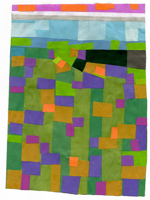
       2.  The Work in Color falls into Two Divisions:  

  • The smaller of the two is technical, and teaches the constituents of mixtures and exactitude in using them, as well as the surprising optical behavior of color combinations when placed side by side.

  • The most useful of the technical assignments is the Color Change, by which a single color may so alter its appearance against different ground that we must call it different names. The Color Change alerts the artist that the material pigment content is only a sham of facts in art, while its truth is what appears to the viewer.  

        3.  Similarly there are visual illusions by which straight lines seem to bend and parallels both to
              spread  and to converge. Thus, to correct unwanted optical effects, the work I show is always
              done freehand.  For even the boundaries of solid shapes are subject to this fooling of the eye.
              Both the color and the line visual effects follow a familiar rule:  If we eat a spoon of honey
              and then bite into an orange, in comparison with that sweet predecessor, the orange will
              taste sour as a lemon.


          4.  My second great teacher, Josef Albers, deserves mention here. From him stem the Color
                Change and other valuable color demonstrations, as well as one signal tenet of visual
                 expression, of which the following example will give you an idea – though its specific form
                 is mine:  “When you draw a profile portrait,” he might say, “give to me the person – not the
                 skull in back – but the identifying features to the front!” This means that off-theme emphasis
                 can be as damaging to pictures as it would be misleading in the spoken tongue. 


  • Composition is often taught by curious rules:  Supposedly there must be balance, focal points, but there must not be any signal element at the center. Or, it is said that the eye moves from here to there in an unending guesswork that could be settled by an electronic instrument capable of tracking down the scan path with precision. Artists proclaim they set up tensions, resulting chiefly in the destructive harm we call distraction. 

  • The failure of such precepts shows in their wide following without a product of very much distinguished art. We should be glad that not every artist practices this kind of thing – although he may like to say he does – or we should lack good work even more than we already do. 
 
  • My Pyramid below stresses by adjusted contrasts the characteristic rising edges, while diminishing the baseline margins. And so it articulates that showing visually closely parallels the lowering and rising volume of common human speech.
Picture
        4.  Composition rules (cont’d)

  • Albers’ insight proved of the greatest service. For I found a way to stretch its clarity into a basic compositional principle of just a little wider range. How this works cannot be shown to full effect with slides, and I shall therefore teach it to you live with “Paper Snippets,” before this series ends. 

     5.  My composition course is a melding of two minds,  Albers’ and mine.

  • Much of the work is done in colored paper, to furnish the most experience in the quickest time. 

  • But some problems are designed for paint, notably a task beginning with a splash and splatter party on large sheets. Out of all these messes, small areas are selected, enlarged, and re-composed. The student learns here careful observation, and starts to grasp his personal limits. For, when he is encouraged to devise any shapes and colors to his liking, he is not even capable of wanting – that is, imagining – the shape configurations he draws upon for this assignment. It is hoped that he will thereby first begin to value the vast visual abundance of the world that surrounds him on all sides as if it were a “spare imagination.” 

  • There are further problems in which the number of areas and colors is strictly limited; but the solution must give no impression of constraint, but only of an ample plenitude of color.  

  • In all such work, two classes of corrective action will be carried out. What seems out of order or fragmented is brought into a coherent unity that will not be of dull sameness, but of ever changing pace. Hence, what seems characterless and slack must be more sharply differentiated, as in the frame-by-frame progression of my demonstration page: Quick, short curves alternate with longer, slower ones, corners contribute angularity, while the thick and thin of line, as well as intervals and solid shapes appear.
Picture
        5.  More on Composition rules (cont’d)

            The viewer re-compounds the unity of a design by his own sustained attention to it. A
             coherence without character – that is, without each part contributing its own unmistakable
             identity – will suffer,  despite its blameless unity, a twofold damage of distraction. One will be
             the boredom of the viewer and the other, in any exhibition, the powerful attraction of
             competing better works. 

        Any person – perhaps not himself an artist but seeking practical experience to help him look at art with a sharper vision – might profit from this First Semester of Design. For its manageable, rather simple, technical demands recommend the course not only to beginners but also to the amateur and layman. But the reach of this course unfolds fully only in the second term.     

Picture

NOTE:
    
(Section on Basic Design Courses to be continued next week)

0 Comments

The Likeness of a Beautiful Thing - 04

4/15/2016

0 Comments

 
In the early 1990s this was given first as a speech to a class at the Lancaster County Art Association, and in briefer form afterwards on a couple of other occasions.
Some of the illustrations come from the text, others from references to physical works that Johannes brought with him, and one from live demonstration.                                                                                              
  (4th of eleven sections)  
Picture
   E.   Practical Knowledge

        Philosophical reflections may lead the artist to many profitable understandings. Practical knowledge, it is said, leads him directly toward action. But, as insight must inform us what is, and what is not, a worthwhile practice, we must not proceed unphilosophically when we enter into action, in order not to paint ourselves into a corner.
  1. The Foundation Program:  I take the closest interest in the first year of instruction at the college level. For, if that program is the product of a sharply focused mind, it can teach with unmatchable lucidity how the many labors of an artist ought to be pursued. Moreover, later – in more specialized activity – neither so crystalline a clarity nor this great variety are altogether possible.

           Though we shall look at works far surpassing a beginning education, foundation study will be
            the perspective from which we pay attention to them.


      2.  The Parts of Art: To study our English tongue we were taught to parse a sentence into its
            grammatical elements and the parts of speech. We thus looked precisely at the constituents
            of language and learned how each one helps to build the whole.


           The Foundation Program has the very same assignment. It divides the body of the artist’s
            learning into the parts of Art, in order to resolve with certainty what each part really is
            and how it therefore can contribute to the entire realm.

      3. 
Descriptive Geometry: Classical art instruction teaches two scientific disciplines, Anatomy
            and Descriptive Geometry. The latter has longer reach and is hence the more important.
            Descriptive Geometry is the scientific study of three-dimensionality, and deals with volumes
            whose surfaces are of three types:


  • Volumes of the Straight Plane type – Pyramids and Cubes
  • Volumes whose surfaces include Curved Planes – Cones and Cylinders
  • Volumes whose surfaces are Double-Curved – such as Sphere and Ovoids, and also the Tire.
3)  (Descriptive Geometry, cont’d)
  1. As a first year course this study may end with the scientific consideration of perspective.

           
Picture
      3 .  (Descriptive Geometry, cont'd)

            
Since every basic study prepares the way for more advanced instruction, we should take
            note – whether or not a given art school offers it – what this advanced work ought
            to be: In Descriptive Geometry that is the combination of volumes in a study
            the Intersection of Form, and the scientific study of light, including – beyond light
            and shade –  Mirror Optics and Refraction.
     
Picture
      4.  Drawing and Observation: This includes learning the use of the pencil as a Sighting Rod
           for the exact spatial disposition of all objects and their parts. But description at its best
           is not a copy of the subject in various shades of gray.
  • The play of light produces a warehouse-full of shape configurations hidden from the lay observer, but equipping the artist with a repertory he could never imagine, let alone design, solely on his own. Once such observations are accustomed work, shaping can be freely altered – even dark and light reversed – for better clarity and more eloquent design. 

Picture
  • To draw the figure, we must differentiate the subtle balance of obliques in the Living Form from the right angles that mostly rule the man-made world. 


Picture
  • Human Anatomy is not Foundation Study. It leads ultimately to a map of muscles, lifelong in the artist’s mind, which is induced upon the skeleton but a little more inclusive than the essential minimum. The study which makes this sparse but lasting memory of a possibility has to be a great deal more elaborate and thorough.

  • The skeleton of animals may be a sufficient clue to the shape and placement of the basic muscle groups, since the principles of leverage remain unaltered, so that a detailed knowledge of Comparative Anatomy – though good to have – will not be indispensable for a persuasive rendering of animalic muscularity.
Picture
Picture

Comment:
     Sometimes college-level students have called the above course material unnecessary for training a visual arts student -- your opinion . . . .


0 Comments

    A Blog containing longer text selections from essays by Johannes, on art, philosophy, religion and the humanities, written during the course of a lifetime.

    Picture
    Artists are not art historians. People who write are not all learned scholars. This can lead to “repeat originality” on most rare occasions. When we briefly share a pathway of inquiry with others, we sometimes also must share the same results.

    RSS Feed

    Categories

    All
    Absolute Meaning
    Aesthetics
    Albers
    Art
    Art Education
    Audience
    Autonomy
    Basic Design
    Color Study
    Composition
    Compound Meaning
    Creativity
    Descriptive Geometry
    Design
    Discovery
    Drawing
    Essay: Identity - 01
    Essay: Identity - 02
    Essay: Identity - 03
    Essay: Identity - 04
    Essay: Identity - 05
    Essay: Identity - 06
    Essay: Identity Of Meaning
    Essay: Likeness Of A Beautiful Thing
    Fine Arts
    God
    Identity
    Illustration
    Intuition
    John-howard-benson
    Josef
    Meaning
    Philosophy
    Poetry
    Potential
    Principle
    Project-stages
    Relative-meaning
    Religion
    Rhode-island-school-of-design
    Risd
    The-identity-of-meaning
    Utility

    Archives

    June 2016
    May 2016
    April 2016
    March 2016
    February 2016


  • Home
    • About
  • Johannes Page
  • Johannes Speaks
  • Johannes Writes
    • Color and Composition
  • Poetry Home
    • Earth's Creatures
    • Straw to Lay a Child
    • Meet Me at the Passage
  • Family Page