|
THIS WEEK – A short section finishes some of the detailed discussion, including pictorial composition, before next week’s FINAL summation.  D. Composition The real work of surpassing the material world is done not through a preferred abstraction, which can vary, but by a discipline named severally “design,” “composition,” or “visual organization,” whose ground rules never vary. If the tasks of composition were always as badly carried out as they are poorly understood, we should suffer a scarcity of well-done work even greater than we now endure. But our burdens of misunderstanding are real, and work their share of damage. The study of visual composition is closely similar to learning Rhetoric in language. If Rhetoric is the study of how to say something persuasively, then Composition in a picture becomes the study of how to show it beautifully.
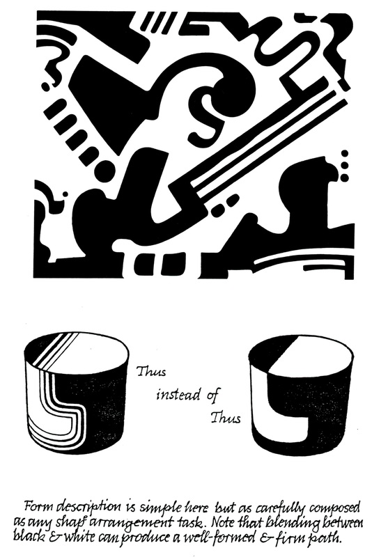
We should un-learn, as best we may, our socially acquired prejudices, but the instinctive operations of the aesthetic sense we have to study, observe, and seek to understand. 4. Tinkering with my demonstration pictures, I shall not try to establish balance. Already the impressionists learned by the snapshot photograph and the Japanese woodblock print that this may be a dubious rule. A double portrait may require balance. But, as we saw, the profile drawing of a head must prefer the character of facial features to the skull in back, and would suffer damage if a rule of balance were applied. Nor shall I tell you that your eye will move from one point to another. Perceptual researchers can – with the assistance of a suitable appliance, show any scan path with precision. And it will not often match the claims of artists. 5. Rather, my examples try to demonstrate how the screeching may be silenced and the music played. But the music sounded here is visual, and the screechings are visual distractions, that is, demands for an attention not justified by any optical appeal. A distracting “noise” will not be nearly so interesting as it may be loud – but not “loud” necessarily. For whispering too can be an emphatic bother and distraction. My process of fitting and adjusting can – to some degree – be duplicated by sequential slide transparencies. But, for a most persuasive showing, it must be demonstrated live. E. The Action of the Paper Snippets Relationships differ from place to place. Thus, only within a given setting can we visually judge and mend what is too big by shrinking, too small by making larger, too bright by making duller, and too dull by causing it to shine. Also, what seems shapeless needs to become form-full, and what is vague – and therefore puzzling – be made clear.
Coherent unity, the desired outcome of this effort, means the best works are best because they have become themselves – that is, without distraction – the full embodiment of all their theme and striving.  
0 Comments
During the past several weeks, Johannes gave detailed descriptions of Basic Design courses. Here, after some final thoughts, the essay returns to philosophical topics - aesthetics. (NINTH of eleven sections)  I. Basic Design within the Foundation Program Within the Foundation Program the two semesters of Basic Design are by themselves a compact summary of an artist’s purely visual work of form and color, as opposed to figure or landscape drawing. Apart from the special mission of three-dimensional composing, the Surface Designs divide the language of their visual domains very carefully into the parts of art and gradually join them toward a plane of competence where the student will be no longer a beginner. To summarize the tasks of a two-semester Basic Design course: Basic Design I:
J. Historical Study 1. Artists need a grounding in Art History to see how cultural excellence – due to causes that fundamentally can never vary – appears in every period and all kinds of places.
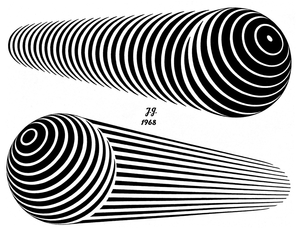
2. Besides needing the History of Art to train their eyes at discerning other workers’ best creations – regardless of how unfamiliar may be the face they wear – artists want this study, as every man must want the history of his own kind, for the assuring companionship it offers.
There is no time for me to treat in our framework any useful portion of the History of Art. But we can deal here with the major steps in the development of Western Writing, whose dual heights of excellence must substitute for the miraculous abundance of the history of art which, alas, at present, poses an unwieldy horn of plenty. 1. Our Alphabet is the lineal descendant of Phoenician characters, which are thought to go back to Egyptian pictographs, or to have been independently contrived in Phoenicia. Aleph the bull became Alpha and “A,” Beth – the house, Beta and “B,” Gimel – the camel, Gamma and “G,” so that our word “Alphabet” itself is of this North Semitic origin. 2. Pictographs are unevenly exact sound-alikes. A picture of a deer could do duty for addressing some we are fond of, as in “my dear” and, less precisely, a “gull” as in seagull might mean a “girl.” When Aleph, Beth and Gimel turned into Hellenic Alpha, Beta, and Gamma, their names became mere pronunciation keys for the initial sound and the Phoenician meanings disappeared. Along the way the pictographs grew simpler and more geometric in design, and so became true letters. 3. Around 200 BC, ill-crafted linear letter skeletons, more of a Latin than of Greek appearance, assumed truly geometric character in the centered horizontal bar of “A” and the semi-circles of “C, D, S and R.” The geometric character since then has been preserved, but was modified correctively to give aesthetic satisfaction. These changes produced in A.D. 100 the Monumental Stone-Carved Roman Capital, with the thicks and thins, as well as serifs of our present day. 4. The monumental Roman Capital is the first of two lettering masterpieces we have in Western Europe.
 5. I am indebted here a second time to John Howard Benson – who was the greatest writing master this country ever had – for my brief history of lettering. In his understanding, Chancery Cursive is the finest possible compromise between the needs of the reading eye and our rapidly writing hand. 6. Should we venture, perhaps rashly, to design an alphabet of our own, we must consider this historic line in order to remain inside the bounds of legibility.
If we paint and draw still lifes, landscapes, or the human face and figure and think that lettering can teach us nothing, then we are not true students of the arts we practice. For an excellence a little off-side of our personal striving allows us to dismiss for a while our own designs and can refresh our fatigued and clouded minds, thus crystallizing our judgment and brightening our vision. To perceive in other disciplines how he may improve within his own, characterizes the ardent student and true learner. III The Likeness of a Beautiful Thing A. Two Questions You owe this portion of the series to a one-time student who wrote me letters with questions about art to which I replied in essay form. One exchange dealt with the theme: “Why do we make art?” Two questions reside within the one:
Both of these are philosophical concerns, and a philosophic bent of mind will help us to consider them. But philosophic learning all alone cannot succeed, because the task requires also the experience of a working artist. Because of this, my discourse will not be exclusively a set of philosophical reflections, nor center only on artistic action. But, giving both their due, we may achieve right understanding and thus reveal most clearly what an artist will find proper and worthwhile to do. B. The Meaning of the Term “Art” Art is a strange word, not for what it means, but what it fails to mean.
In the great puzzles of existence, groping in the dark may be common in Philosophy. But otherwise, so much groping in the dark is not altogether usual, because language strives for our understanding, and not to deepen the confusion. For example, “lawnmower” and “dishwasher” proclaim at once what these appliances are and the service they deliver. My task is to make as precisely clear what art is and it does for us, as the names lawnmower and dishwasher make clear the function of those objects. To make as clear, however, does not mean to state as briefly. On the contrary, I must, to some degree, become substantially long-winded. C. The Claim Implied through Showing Art
rich reward.
  Comment:
Has some other discipline offered you insight into the practice or appreciation of visual art? END of Middle of Essay – Illustrated section on Basic Design, last Segment The reader may consider the current long, illustrated section to be a digression. Johannes describes courses for Basic Design in the Visual Arts suitable for both art students and those in other fields of study. After this last Segment the Essay returns to more general discussion of art education and art theory.  H. Two-Dimensional Design, Second Term (cont'd) 7. Motion: Blur passages of movement are observable chiefly in rapid reciprocal and rotated motion which tend to render the moving parts unreadable.

 8. Texture:
 9. Form Articulation: Basic Design II as a college course includes neither motion nor texture, but ends with form articulation.
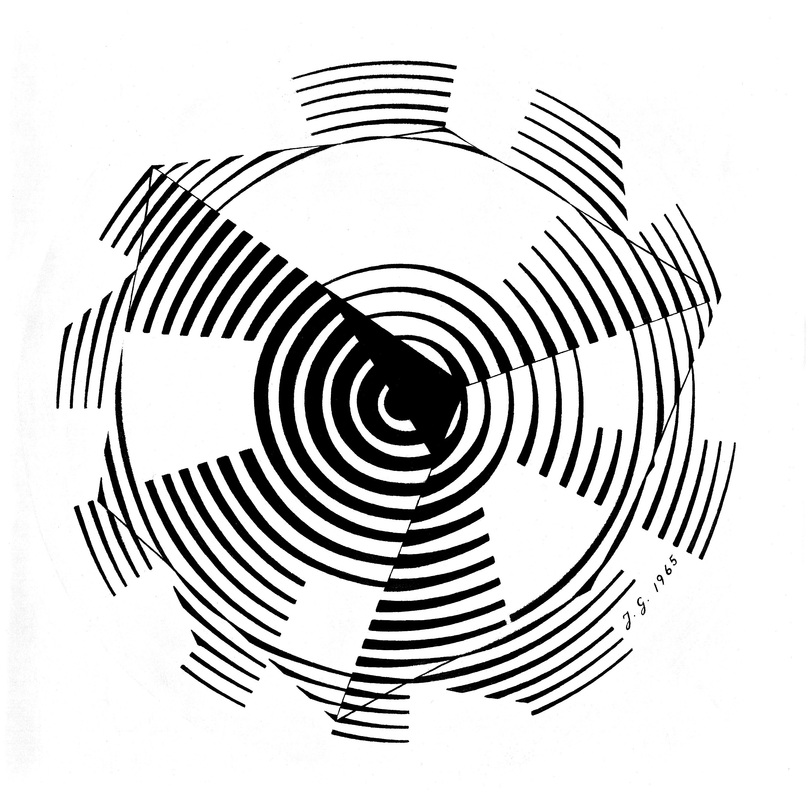
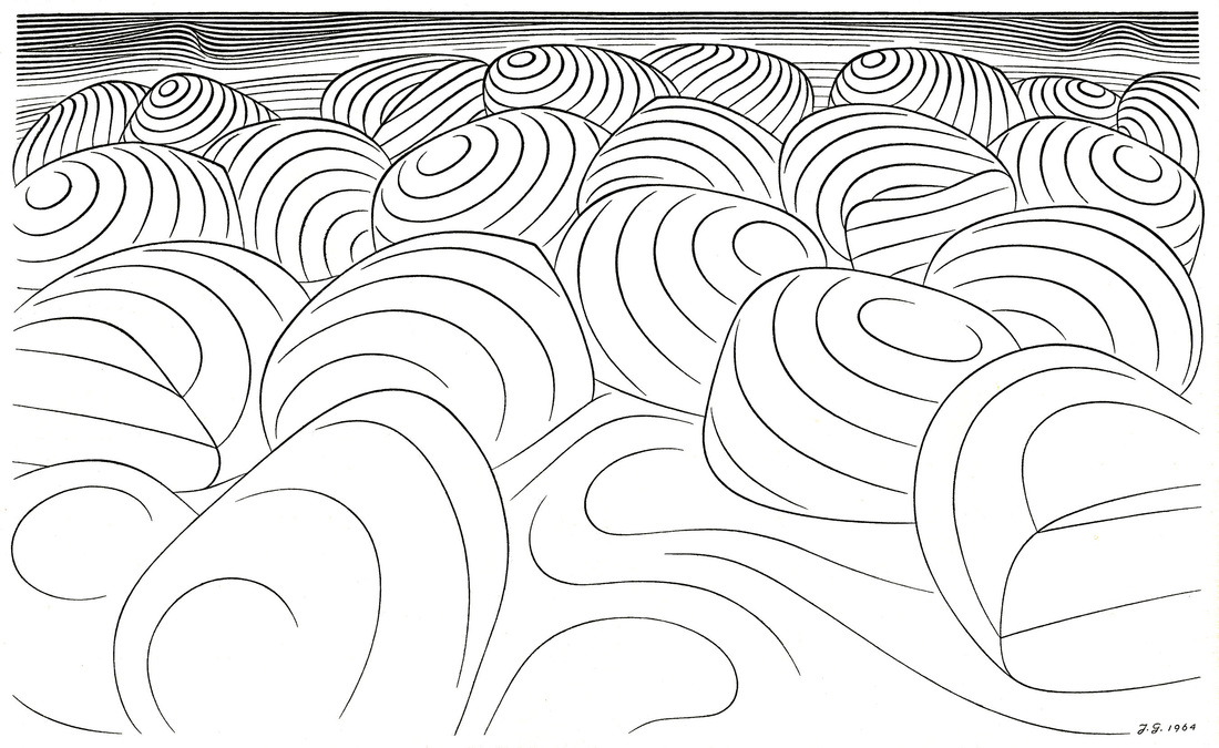
  Middle of Essay – Illustrated section on Basic Design, 3rd of 4 Segments The reader may consider the current long, illustrated section to be a digression. Johannes describes courses for Basic Design in the Visual Arts suitable for both art students and those in other fields of study. After these 4 Segments the Essay returns to more general discussion of art education and art theory. Rather than omit this section, it is included as part of the original essay.  6. Detail and Mass: We grasp readily how spherical sections derived from the latitudes and longitudes of the globe render its form legibly and clearly. But any pattern may be altered to conform to any surfaces. For the most complex configurations do only three things against the perspective grids we can inscribe upon all forms:
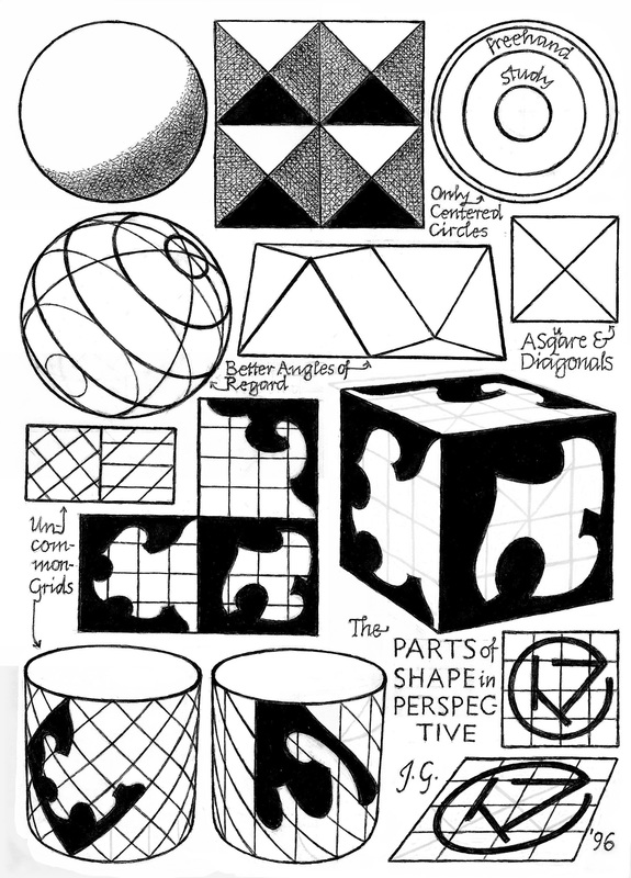 6. Detail and Mass (cont’d)
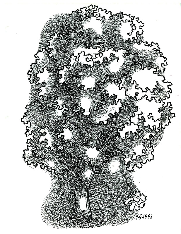
Since the limits of a shape configuration are linear, suitable line elements – as my human profile shows – can render form as readily as solid areas. 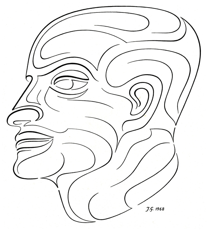 6. Detail and Mass (cont’d)
 6. Detail and Mass (cont’d)
  |
A Blog containing longer text selections from essays by Johannes, on art, philosophy, religion and the humanities, written during the course of a lifetime. 
Artists are not art historians. People who write are not all learned scholars. This can lead to “repeat originality” on most rare occasions. When we briefly share a pathway of inquiry with others, we sometimes also must share the same results.
Categories
All
Archives |
| von Gumppenberg | Johannes Writes |
 RSS Feed
|
|