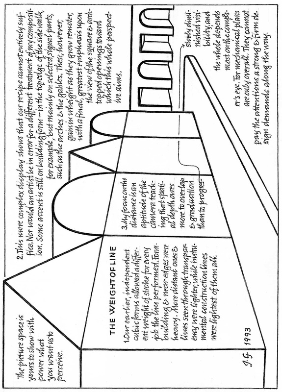
|
END of Middle of Essay – Illustrated section on Basic Design, last Segment The reader may consider the current long, illustrated section to be a digression. Johannes describes courses for Basic Design in the Visual Arts suitable for both art students and those in other fields of study. After this last Segment the Essay returns to more general discussion of art education and art theory.  H. Two-Dimensional Design, Second Term (cont'd) 7. Motion: Blur passages of movement are observable chiefly in rapid reciprocal and rotated motion which tend to render the moving parts unreadable.

 8. Texture:
 9. Form Articulation: Basic Design II as a college course includes neither motion nor texture, but ends with form articulation.
0 Comments
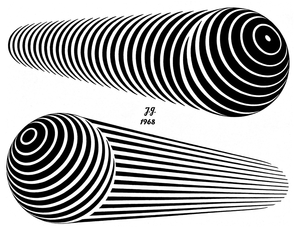
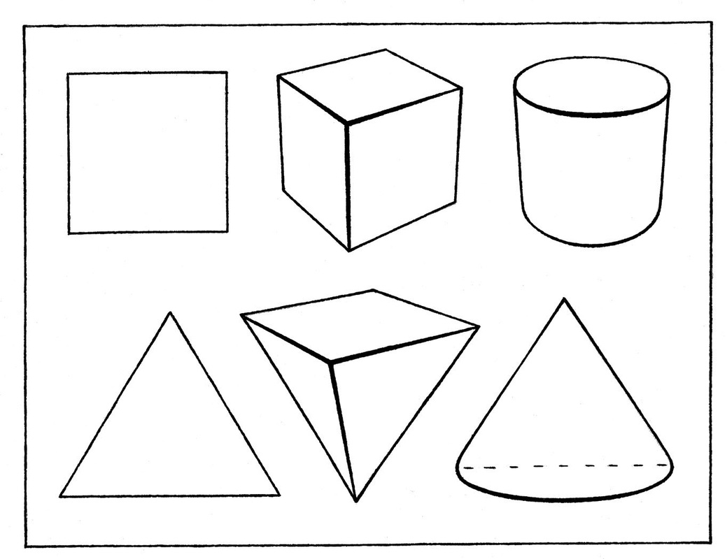
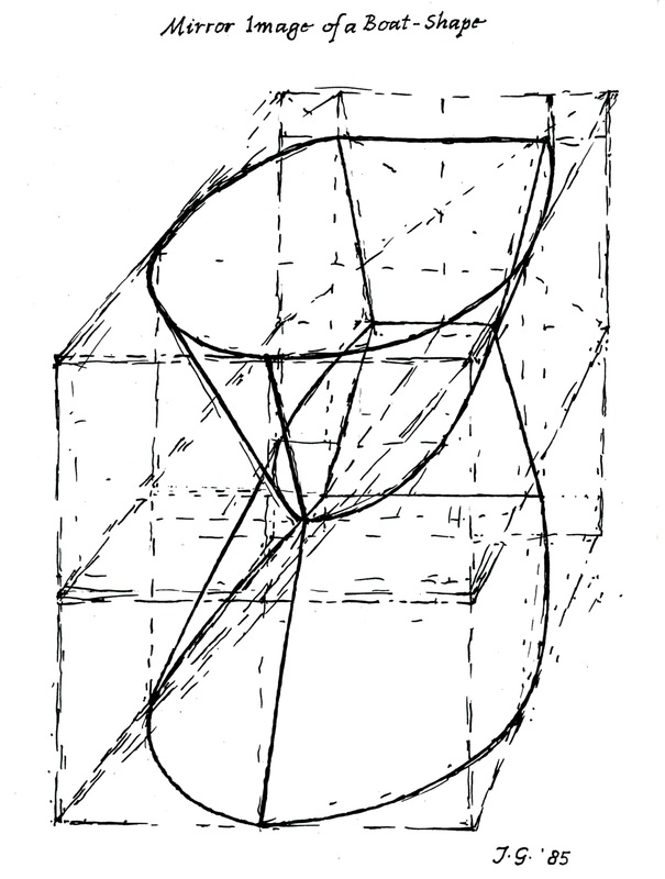
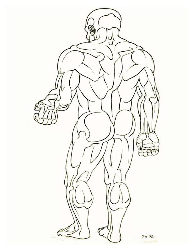
Middle of Essay – Illustrated section on Basic Design, 3rd of 4 Segments The reader may consider the current long, illustrated section to be a digression. Johannes describes courses for Basic Design in the Visual Arts suitable for both art students and those in other fields of study. After these 4 Segments the Essay returns to more general discussion of art education and art theory. Rather than omit this section, it is included as part of the original essay.  6. Detail and Mass: We grasp readily how spherical sections derived from the latitudes and longitudes of the globe render its form legibly and clearly. But any pattern may be altered to conform to any surfaces. For the most complex configurations do only three things against the perspective grids we can inscribe upon all forms:
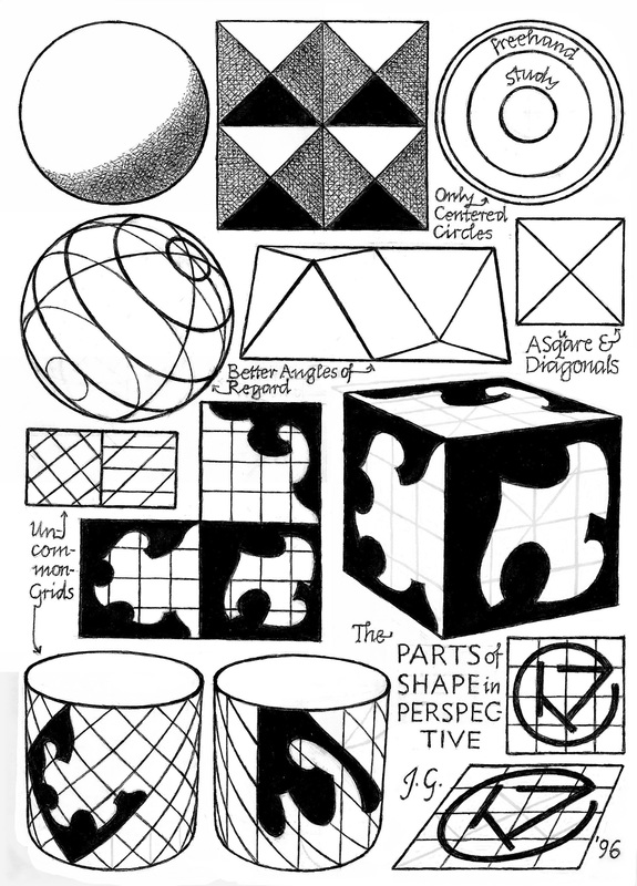 6. Detail and Mass (cont’d)
Since the limits of a shape configuration are linear, suitable line elements – as my human profile shows – can render form as readily as solid areas. 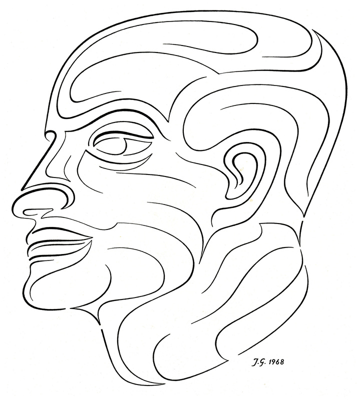 6. Detail and Mass (cont’d)
 6. Detail and Mass (cont’d)
  Middle of Essay – Illustrated section on Basic Design, 2nd of 4 Segments The reader may consider the current long, illustrated section to be a digression. Johannes describes courses for Basic Design in the Visual Arts suitable for both art students and those in other fields of study. After these 4 Segments the Essay returns to more general discussion of art education and art theory. Rather than omit this section, it is included as part of the original essay.  H. Two-Dimensional Design, Second Term
This once seamless continuity of learning may now be weakened, because Modern Art inclines more to celebrate that man is able to emote and feel instead of his ability to reason, know and understand. To emote and feel is no achievement – we may as well take pride in the possession of an alimentary canal. What I feel may gradually grow apparent; but what you and I can learn and understand together is the reason for this program. 2. Abstraction: The self-understanding of Modern Art regards abstraction as its central innovation, but its grasp of what that really is seems very vague at best. For Modern Art has sought to tell us that Abstraction equals progressive Non-Representation, where the least recognizable equals the most abstract.
3. The First Operation of Abstraction: A dog, a tree, a table and a stone differ sharply from each other but share a property of cubic magnitude. They each possess Height, Depth and Width – the attributes of Volume. Thus, Volume is a signal Derivation from the unwieldy visible abundance of the world and – here particularly the Abstraction of Dog, Tree, Table and Stone.
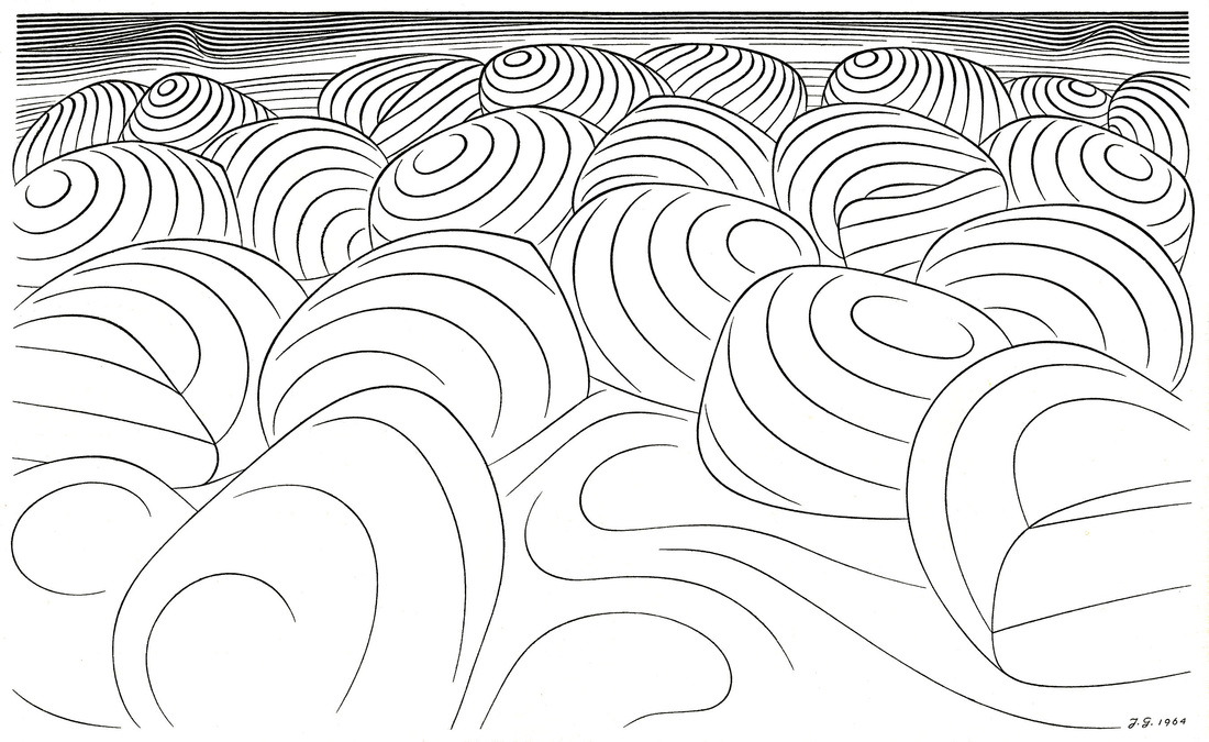
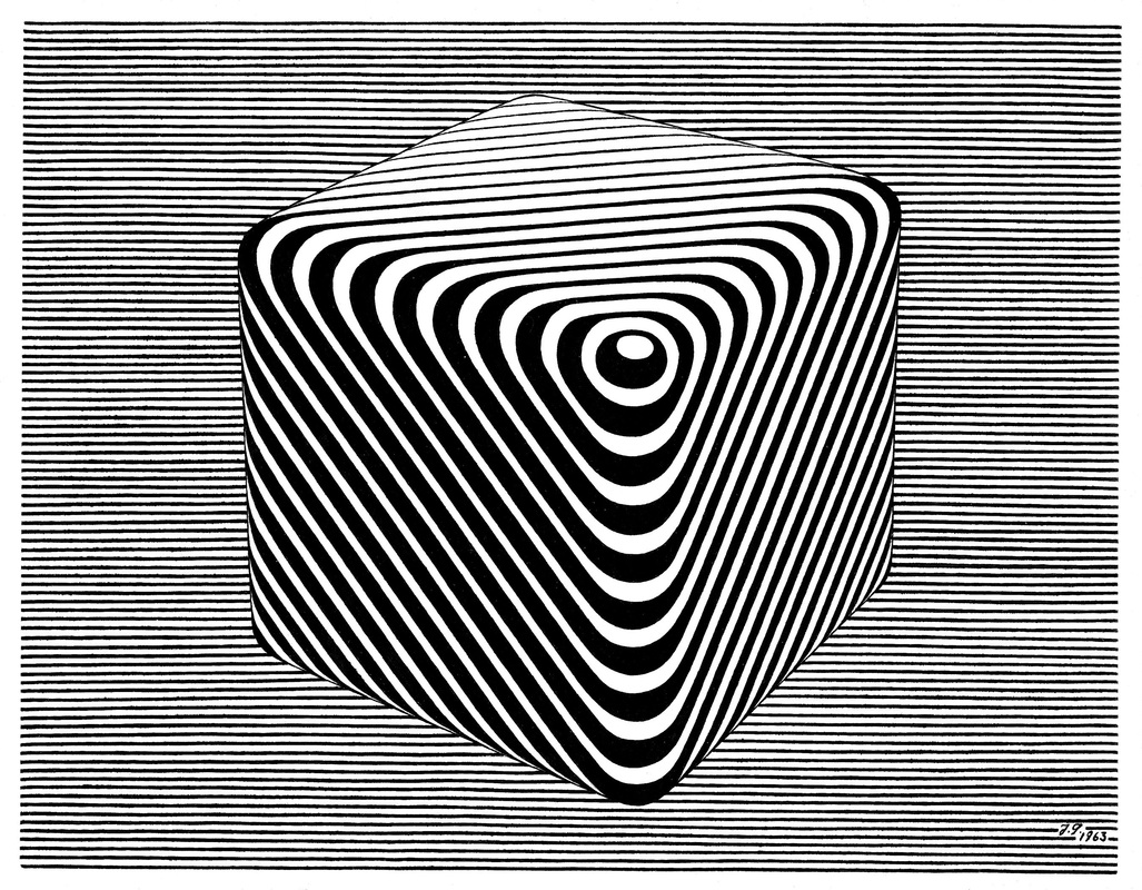
 Abstraction (cont’d) 4. The Second Operation of Abstraction: If you compare my outlined volumes to the picture below which my wife has named The Floating Cube, you discover the latter to be more complex and offered in a setting to strengthen the illusion of a solid body advancing from a depth of space. It is the terminal abstraction and completion of my task, derived – like all foregoing stages – from the Final Cause that posts the artist’s problem.
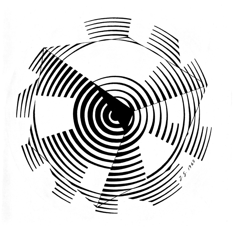
 5. The Continuity of Surfaces: The experiment of my faulty intuition resulted in a final sphere illustrating an acoustic fancy in which voices of exactly regulated volume are calling to a blind man to let him hear the sphere he cannot see.
  (Section on Basic Design Courses to be continued next week)
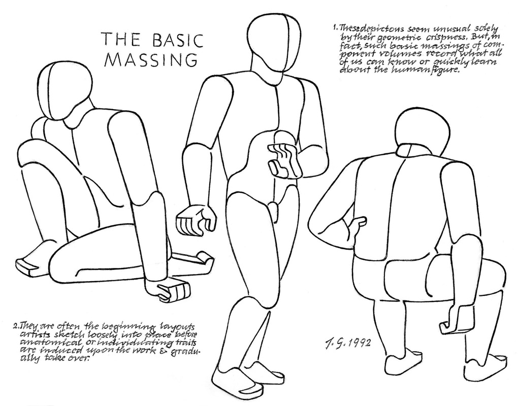
Middle of Essay – Illustrated section on Basic Design, divided into 4 Segments. The reader may consider the next long, illustrated section to be a digression. Johannes describes courses for Basic Design in the Visual Arts suitable for both art students and those in other fields of study. After these 4 Segments the Essay returns to more general discussion of art education and art theory. Rather than omit this section, it is included as part of the original essay.  II The Transmission of Knowledge (cont'd) F. The Basic Designs
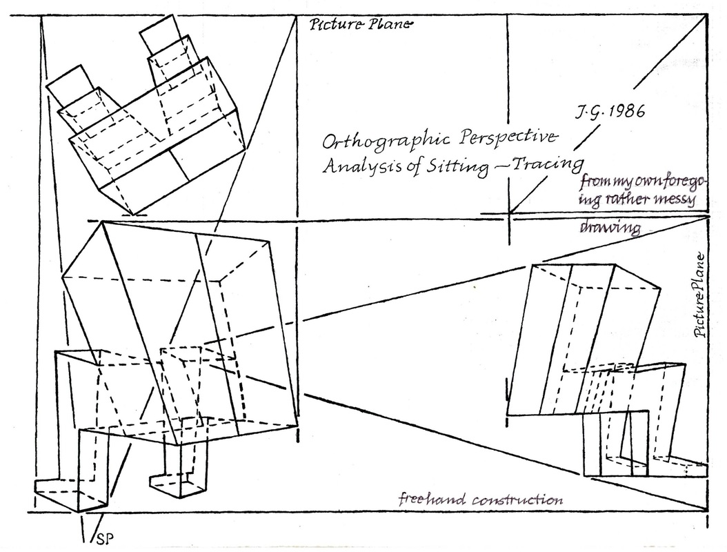
But I have never taught this demanding discipline of composition whose results must give satisfaction from all angles, and I therefore hold no views about which inclusions – in what order – provide the best instruction For Three-Dimensional Design. 2. Two Dimensional Design:
G. Two-Dimensional Design, First Term A study with the aim of constituting the enabling fundament of all the labors of the colorist and draftsman is an ambitious plan. But Basic Design will either be of basic value to the wider tasks of art or else becomes a detour and superfluous delay. Yet our beginning will be unpretending and extremely simple. Two-Dimensional Design, First Term, is pursued with least expensive materials and tools, but is capable of covering the widest range of visual learning.
 2. The Work in Color falls into Two Divisions:
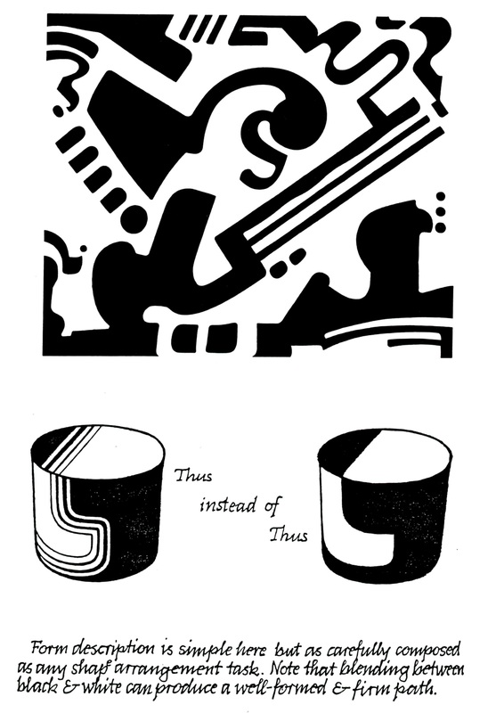
3. Similarly there are visual illusions by which straight lines seem to bend and parallels both to spread and to converge. Thus, to correct unwanted optical effects, the work I show is always done freehand. For even the boundaries of solid shapes are subject to this fooling of the eye. Both the color and the line visual effects follow a familiar rule: If we eat a spoon of honey and then bite into an orange, in comparison with that sweet predecessor, the orange will taste sour as a lemon. 4. My second great teacher, Josef Albers, deserves mention here. From him stem the Color Change and other valuable color demonstrations, as well as one signal tenet of visual expression, of which the following example will give you an idea – though its specific form is mine: “When you draw a profile portrait,” he might say, “give to me the person – not the skull in back – but the identifying features to the front!” This means that off-theme emphasis can be as damaging to pictures as it would be misleading in the spoken tongue.
 4. Composition rules (cont’d)
5. My composition course is a melding of two minds, Albers’ and mine.
 5. More on Composition rules (cont’d) The viewer re-compounds the unity of a design by his own sustained attention to it. A coherence without character – that is, without each part contributing its own unmistakable identity – will suffer, despite its blameless unity, a twofold damage of distraction. One will be the boredom of the viewer and the other, in any exhibition, the powerful attraction of competing better works. Any person – perhaps not himself an artist but seeking practical experience to help him look at art with a sharper vision – might profit from this First Semester of Design. For its manageable, rather simple, technical demands recommend the course not only to beginners but also to the amateur and layman. But the reach of this course unfolds fully only in the second term.  NOTE:
|
A Blog containing longer text selections from essays by Johannes, on art, philosophy, religion and the humanities, written during the course of a lifetime. 
Artists are not art historians. People who write are not all learned scholars. This can lead to “repeat originality” on most rare occasions. When we briefly share a pathway of inquiry with others, we sometimes also must share the same results.
Categories
All
Archives |
| von Gumppenberg | Johannes Writes |


 RSS Feed
|
|