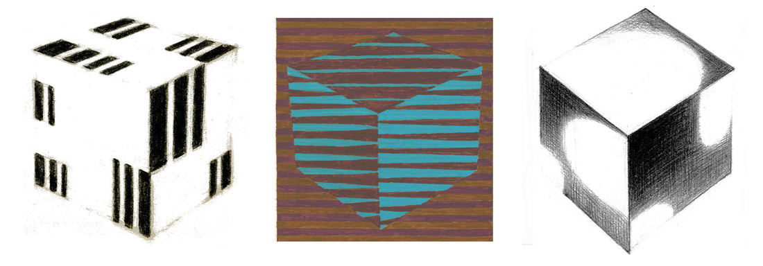
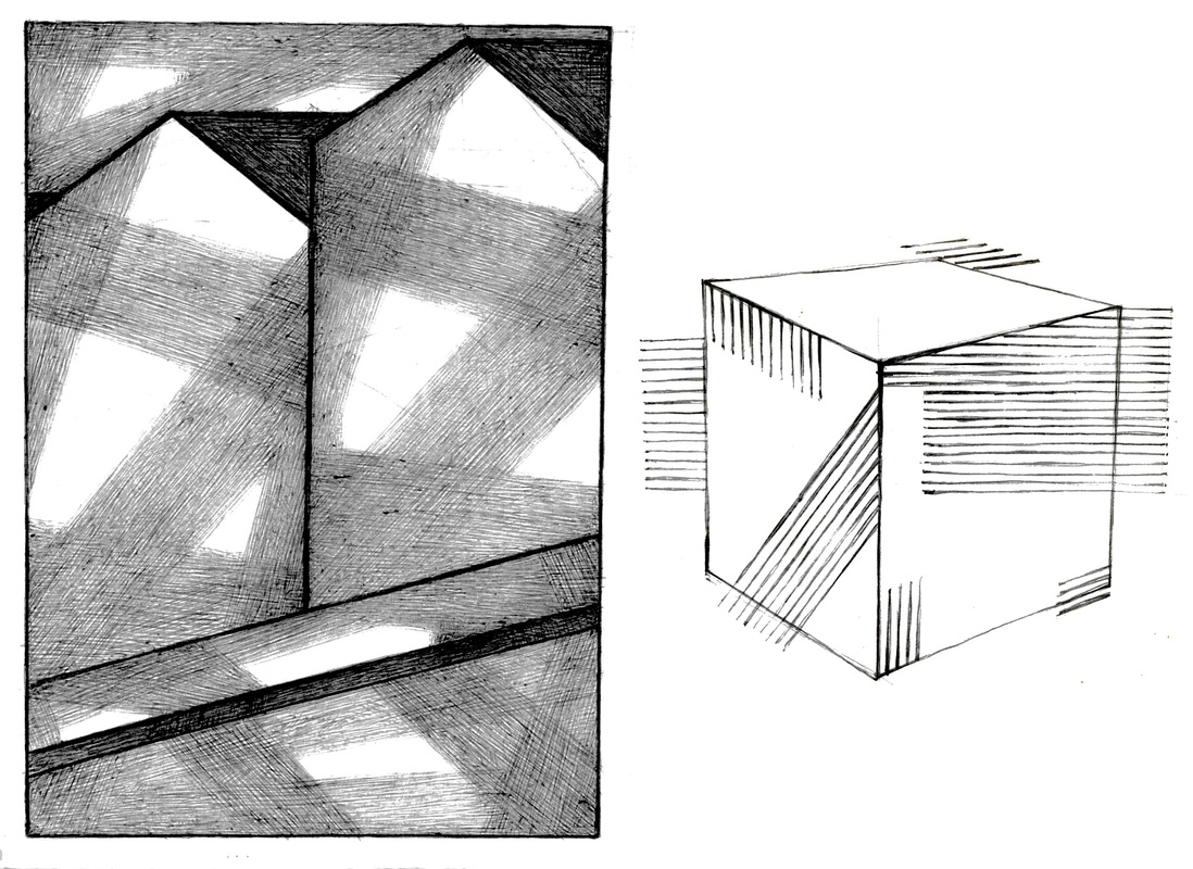
 In Hitler’s Germany Modern Art was a forbidden art.  In the first years following the war I saw samples of this art with only uncomprehending eyes. Then in the USA took place at Rhode Island School of Design my first meeting with the art of my own time. It was “love at first sight.” I felt I had arrived to take a part in a sun-rise burst of color and an unprecedented inventive excellence of form. Sometimes that fulfillment seemed in reach just around the corner. Hitler’s stranglehold was the obvious tyranny. Many tyrannies of fashions advancing ever like invasive weeds into the art community bring to us a slyly sneaking, but also more enduring, trouble. 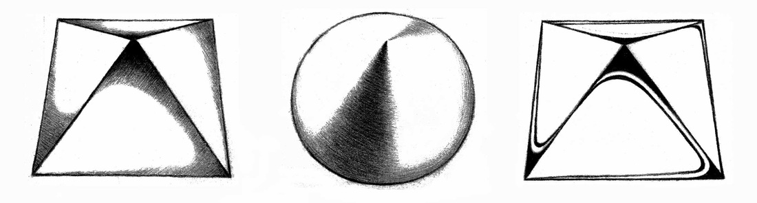 The Art Student and the Art School One kind of art in vogue or another dominates from time to time. There is also a seeming plenitude of variety. We note, however, a fashion in our schools which has grown a weighty burden. It is, contempt for what we name “academic learning.” From Modern Art can arise – and partly have arisen – insights of fundamental learning useful to the valuation of any period. In our time all profess admiration for the excellence of Paul Cézanne. That achievement was three-fold: composition, solid form, and color. These are the essentials of the painter’s art. At Yale Josef Albers set up the course for a right study of color and composition. This gain, now lost mostly to neglect and then oblivion, needed to be cultivated and enlarged. Solid form has been my chosen work. This was not a mere modeling in light and shade. Instead, the aim was the precise description of the volumes while taking possession of each surface as a field of action to be creatively explored for free display. 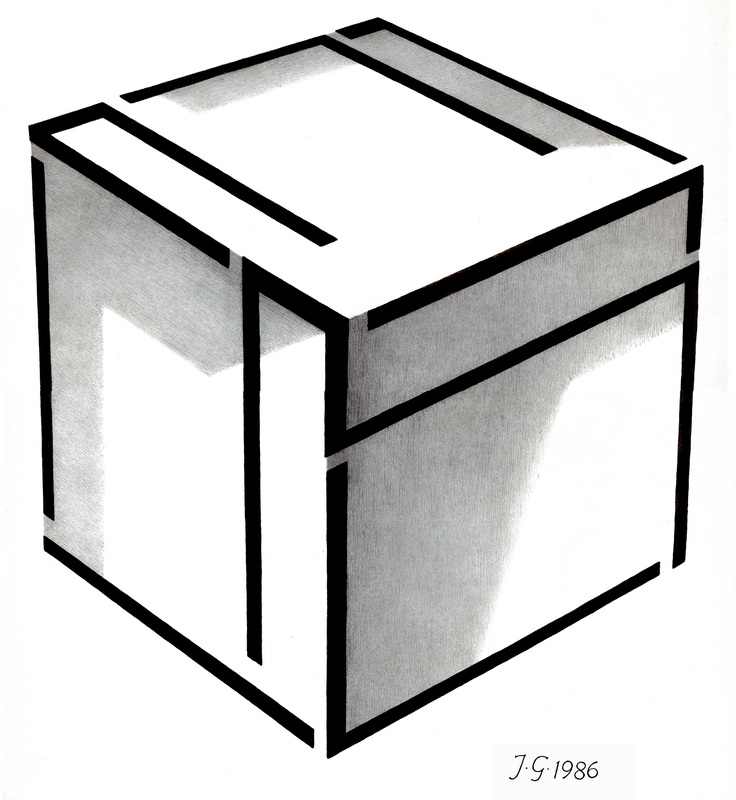 It is an oddity that all our art community talks admiration for Cézanne but treats negligently that to which Cézanne gave his industrious care.  There are several helps where our talent is not quite enough. My illustration demonstrates that any shape arrangement can be made to fit the perspective situation of any form. Thereby, every surface is made usable as the designer-artist’s personal field of action. 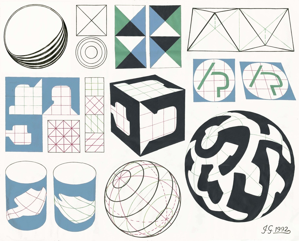 Form Description |


|  |
Though knowing much is surely very good, it is measurably better to comprehend deeply and exactly. Owing to that great talent, John Howard Benson – in his task field and at his time – was the best in the world.


If you read my log you will have met one of my great teachers. Josef Albers is a second.
Albers’ color course at Yale was then the sole basic design study really foundational to our work to follow. Colored papers – torn or cut – gave more color learning than paint and brush could have supplied.
Albers’ color course at Yale was then the sole basic design study really foundational to our work to follow. Colored papers – torn or cut – gave more color learning than paint and brush could have supplied.
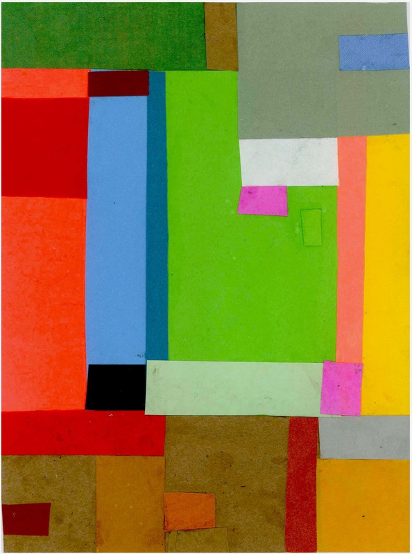
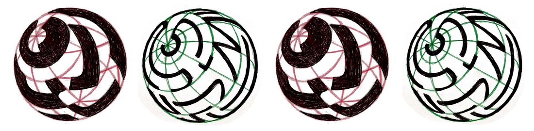
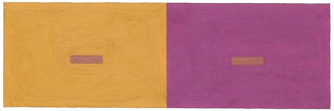
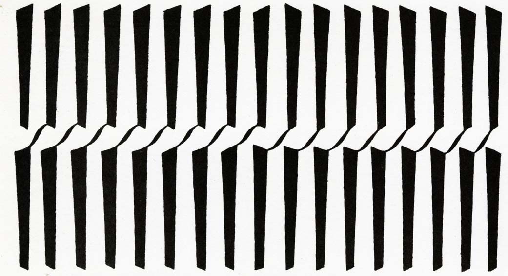
Colored papers taught also the “simultaneous contrast color-change.” One color may so alter upon different grounds that we give this single color different names – here, once “purple” and, once “ochre.”
Albers did not waste his words teaching us not to allow one content or another into the middle of a work, nor on recommending “balance.” What he said was more weighty and a deal more useful. Of a student’s painting he remarked, “I can read this. This is FLOWERS in a bowl.” It was not neglected bitsy pretties in a BOWL. To thus serve the theme and striving of a work teaches how inclusions either damage or support our effort.

“I do not believe in self-expression.” Albers’ utterance here causes me to remember another by a friend to a foreign friend, both figures of fiction: “If you can’t be yourself, you’ll have nothing to put in the pot.” We easily miss that the two sayings tell the same meaning from opposite directions of regard.
Albers held that the unimproved, uncorrected self was not the equal of educated and industrious creative individuality.
The friend said to the friend, “Let not one of our bad examples tempt you. But bring to us the good you own and join it to the good already here in place.”
It is what Albers once said to me of German and American traits – and said it in his native tongue: “Man muss beide im Guten vereinen.” “One must unite the two in that which is good.”

I am very fond of our local library, and fonder still of the learned and kind ladies there.
It is almost three years ago that the library celebrated a May as “Poetry Month.” Floor to ceiling on a hallway wall appeared a depiction of “The Poe-Tree.”
Twisted brown paper made a twisty trunk and branch, and construction paper cutouts – a leafy crown of green. A table underneath bore three supplies: scotch tape, bright red circular paper apples, and slips of white paper. Upon the slips patrons were urged to write verses of their choice, tape these to an apple, and the apple on the tree.
In time “The Poe-Tree” sparkled white on red and red on green without any contribution made by me. For this, my wayward way, I received the scolding due. I promised to improve, and here is my result:

I proclaim the Ladies of the Library
where Grace and Learning are the year-round rule
and old and young come year-round back to school.
where Grace and Learning are the year-round rule
and old and young come year-round back to school.

Our friend, Rowena, former librarian, once said, "A library is a community of people, somewhat like a church, except that they don't all gather together at once." Would you care to comment?

Of the several fine teachers who instructed me as a young man, three were truly great. One, to those who did not know him, Charles Sylvia, the Swimming Coach of Springfield College, will be a surprise. At the start of summer over an extended weekend, Professor Sylvia conducted an aquatics school to sharpen our craft for the summer’s work of teaching aquatic skills to kids.
With lucid intellect and with concision – the need to save time obvious – Charles Sylvia complemented and gathered into clear coherence the particles of our comprehension. Sylvia then named that coherence “Basic Knowledge.”
Insights and aptitudes acquired singly come together as principles – that is, as rules we use in the work we do. If from such rules is built a useful whole, we will have gained a body of fundamental lore or Basic Knowledge.
My sketch below was drawn to explain descriptive geometry to a one-time student. The rendering is a model of Orthographic Projection, the enabling tool of the early industrial age.

In level-drafting, the model delivers the three views we mostly want, thus:
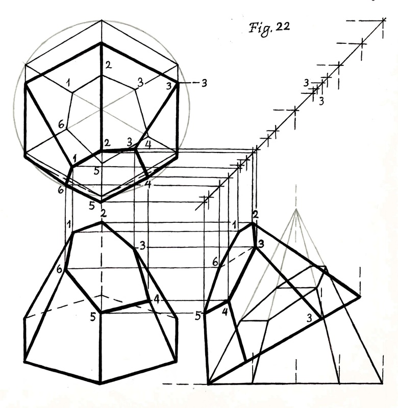
By their ground plan and elevation renderings, and deep perspective views, we might mistakenly suppose the architects and artists of the Renaissance to have mastered descriptive geometry already – not so. The work was done three hundred years later at the time of Napoleon by Gaspard Monge.
Through his edifice of fundamental learning, Gaspard Monge made himself preceptor of the progressive world, and saved that student time – not to squander, but to build and to create. His is a most excellent example of that Basic Knowledge that Professor Sylvia wanted us to learn and put to use.
Through his edifice of fundamental learning, Gaspard Monge made himself preceptor of the progressive world, and saved that student time – not to squander, but to build and to create. His is a most excellent example of that Basic Knowledge that Professor Sylvia wanted us to learn and put to use.

You might comment on a teacher whose "fundamental" teachings went well beyond the announced course subject matter . . . .

There is lofty speech in the colleges and universities on disinterested -- that is, impartial -- pursuit of truth. There is noble sentiment, again, on unfolding students' individuality through centering the action of learning and instruction on their persons.
These disparate aims cannot quite join into an accord, but they want to tell the students they are loved. The price tag of a college education may soon reach 200,000 dollars. Can really so much love exist in academia?
These disparate aims cannot quite join into an accord, but they want to tell the students they are loved. The price tag of a college education may soon reach 200,000 dollars. Can really so much love exist in academia?

The colleague long ago whom I most respected judged better:
"It is the purpose of an education to save the student time," and "The student should not want to be the center of the educational process, for, if he is, he gets a lousy education."
John Spencer
Wherever may be found his likes, let me salute them here.
"It is the purpose of an education to save the student time," and "The student should not want to be the center of the educational process, for, if he is, he gets a lousy education."
John Spencer
Wherever may be found his likes, let me salute them here.

Question you might like to comment on : When and why is "student-centered?" appropriate?
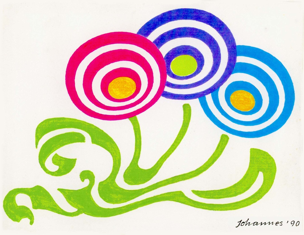
Johannes
von Gumppenberg
Artists, in the end, either teach themselves, or must remain untaught, forever.
 RSS Feed
Archives
September 2016
August 2016
July 2016
June 2016
May 2016
April 2016
March 2016
February 2016
January 2016
Categories
All
Abstraction
Alphabet
Artist
Calligraphy
Color
Completion
Composition
Creativity
Drawing
Education
Emotions
Errors
Exercise
Fashion
Feelings
Form
Fulfillment
Graphic Design
History
Humor
John Howard Benson
Josef Albers
Lettering
Meaning
Perfection
Philosophy
Phonetics
Poetry
Reflections
Viewer
Visual Design