• Home
    • About
  • Johannes Page
  • Johannes Speaks
  • Johannes Writes
    • Color and Composition
  • Poetry Home
    • Earth's Creatures
    • Straw to Lay a Child
    • Meet Me at the Passage
  • Family Page
  von Gumppenberg

Johannes Speaks                                        

Modern Art -- Forbidden Art

8/26/2016

 
Picture
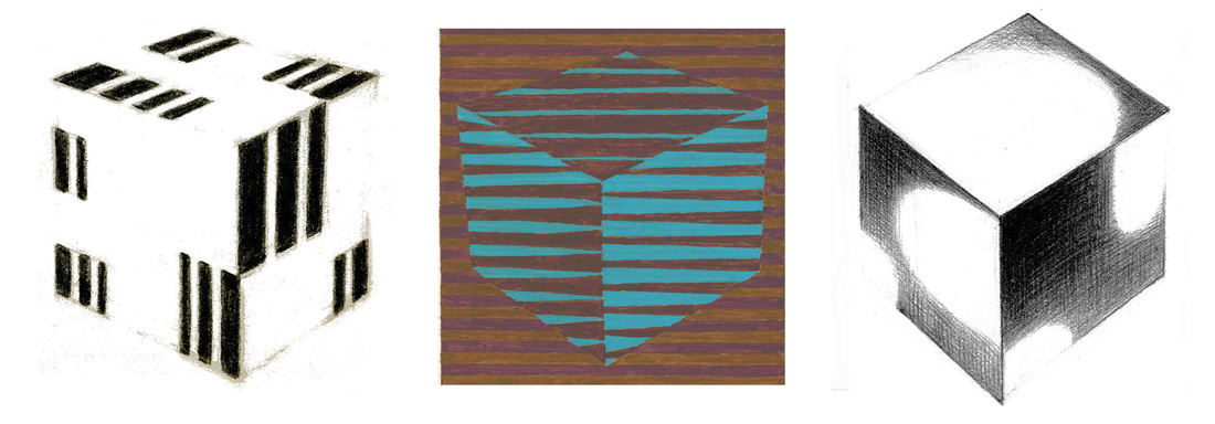
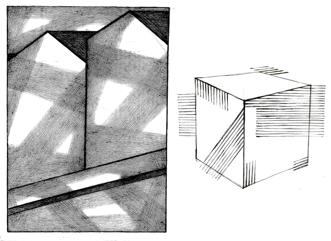
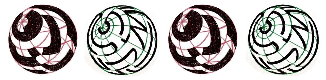
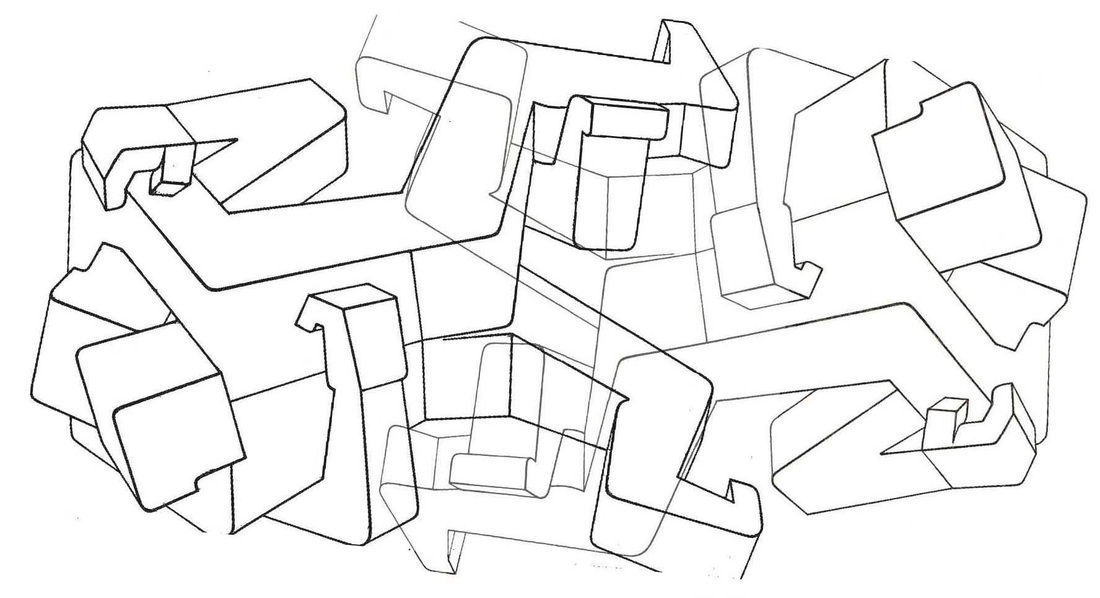
In Hitler’s Germany Modern Art was a forbidden art.
Picture
In the first years following the war I saw samples of this art with only uncomprehending eyes. Then in the USA took place at Rhode Island School of Design my first meeting with the art of my own time. It was “love at first sight.” I felt I had arrived to take a part in a sun-rise burst of color and an unprecedented inventive excellence of form.

Sometimes that fulfillment seemed in reach just around the corner. Hitler’s stranglehold was the obvious tyranny. Many tyrannies of fashions advancing ever like invasive weeds into the art community bring to us a slyly sneaking, but also more enduring, trouble.


Picture

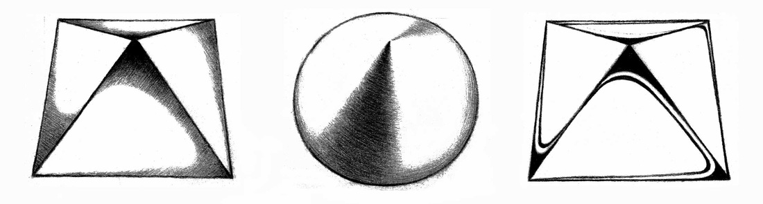
The Art Student and the Art School

 
One kind of art in vogue or another dominates from time to time. There is also a seeming plenitude of variety. We note, however, a fashion in our schools which has grown a weighty burden. It is, contempt for what we name “academic learning.”

From Modern Art can arise – and partly have arisen – insights of fundamental learning useful to the valuation of any period.


In our time all profess admiration for the excellence of Paul Cézanne. That achievement was three-fold:  composition, solid form, and color. These are the essentials of the painter’s art.

At Yale Josef Albers set up the course for a right study of color and composition. This gain, now lost mostly to neglect and then oblivion, needed to be cultivated and enlarged.

Solid form has been my chosen work. This was not a mere modeling in light and shade. Instead, the aim was the precise description of the volumes while taking possession of each surface as a field of action to be creatively explored for free display.

Picture
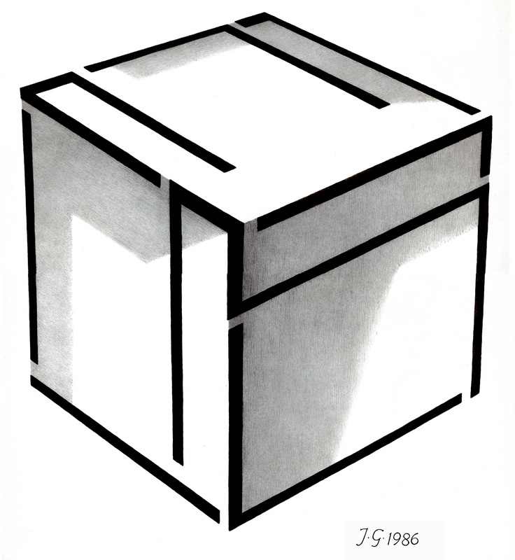
It is an oddity that all our art community talks admiration for Cézanne but treats negligently that to which Cézanne gave his industrious care.
Picture
There are several helps where our talent is not quite enough.

My illustration demonstrates that any shape arrangement can be made to fit the perspective situation of any form. Thereby, every surface is made usable as the designer-artist’s personal field of action.
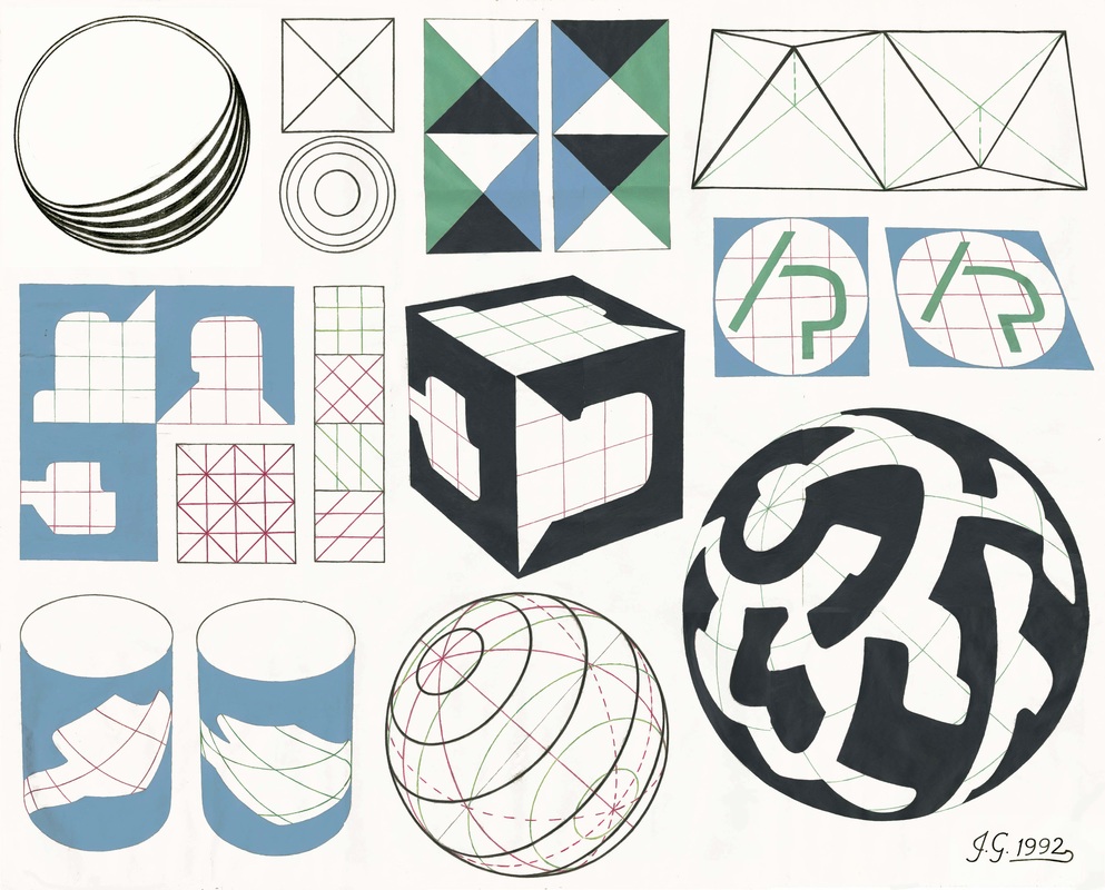
Picture

Form Description
 

Alert and sharpened eyes must contribute here accurate observing. So is made available a treasury of shape and color combinations our brain cannot invent. These serve best when we re-design in order to improve, not copy, them.
Picture
By the simplicity of overlap and by seeing background and figure separations, we can discern near and distant. Solid structures in precise perspective and in the perspective of intervening atmospheric mist supply the facts of actual space.
Picture

Shaping Lines and Tone Here or There as Intervening Mists

 
The space of picture-making is not a featureless void. Ruled by inventive purpose, the mist of atmosphere may overlay what is our will to keep somewhat – but not wholly – out of sight. Thus we remind the viewer of these two perspectives, that of the vanishing point and that provided by the atmosphere, but employ them entirely to carry to completion a creative goal.

Picture

We step forward with our best designs.
The nearest point of the sphere lies in the center of the circular perimeter. But the weight of this display shows well above that middle point.

 
Our burden is not the occasional dominance of one art form in short-lived vogue. It is that our schools have enslaved their students to a needless ignorance. Yet the learning that I speak of might have been unfolded excellently with a modern outlook on shape and color and design.

Because our schools have been thus negligent too often, their students abide still in chains – less visible than those of past dread times – but I think they do exist.


Picture
The art of the galleries may inspire us, but must not lead. For the galleries are a commercial corner-cutting world. Composition, solid form, and color, supported by a treasury of profound observing, are the indispensable-best study plan.
Picture
Note:  The structure of forms and the causes by which we judge near and far derive from observation. These may therefore be joined in one class of learning with the pattern-play of shapes and colors on the surfaces of solids. 

Dear Reader . . . .

8/19/2016

 
Picture
A difficulty has this month arisen interfering with the continuity of the log.
We hope you will continue reading our product in the future. We are and will be grateful for your attention.
Once more, I am asking for your indulgence.
Picture

"Kerfluffle" -- a Commotion, Fuss or Bother

8/12/2016

 
Picture
Janet taught me the word. And on my own I learned how to escape the trouble that word means.
 
Note this example of my sterling common sense. Thus I reasoned brilliantly, I think, that the stairs to our basement make really a superior laundry chute  For I pitched – as had grown my wont to do – some shirts and socks and other items down my well-loved way, when that day a stentorian voice caught me off my guard:
        “I saw that, Johannes!”
        “Yes, dear,” was Johannes’ meek and peaceable reply.  

Was this not a crafty way to avoid a main “kerfluffle”? “Yes-DEAR-ing” is indeed a time-much-tested refuge from the Wifely Wroth.


Picture

After all, “kerfluffles” are best when they don’t happen. You believe me, don’t you, if I tell you that I never, ever raise a fuss?
So with my best superior mien I sometimes pick tenderly on Janet for “big-dealing” trifles. Now I can frame my complaints with much more eloquence: “Do please stop ‘kerfluffling’ me.”

We husbands are a brilliant lot. Or do you think it’s all low cunning?

Picture

Strange Growth on Janet's Kitchen Floor

There remains one more little thing to tell. One day I came down the basement stairs and, at the bottom, were to be seen “loveable dainties” – none of them my own – ’NUFF said! 
Picture

John Howard Benson -- Artist, Thinker and Teacher

8/5/2016

 
Picture
I entered Rhode Island School of Design – RISD, sounded with affection always “RIZ-DY” – in 1951. At that time John Benson, due to failing health, no longer offered lettering instruction. He continued, however, to teach a course scheduled for the entire sophomore class: 
Picture
There has been a vogue of recording “great lectures.” These tended to be only middle-depth in content, rather neatly put together and a little too “dynamically” delivered. John Benson was much different and much better.

The course was constructed with exceptional lucid care. Singly, the talks were given with measured calm and very clear exactitude. The pace of progress was always exceedingly reliable, but never hurried. These readings by John Benson were the finest I have ever heard. Swarms of words tend to evade, not master, difficulties.

Picture
In Benson’s concentrated thinking power, and his patient and incisive discourse, lay our path ahead. The course achieved its excellent success meeting once a week for merely one semester.
 
 
I never exchanged a word of conversation with this, the most revered of all my teachers – nor did many of my classmates, for we were more than one hundred students in a great lecture hall.
 
A few years later John Benson died, and some years after that I became once more his student. I have two books written by John Benson: one is the translation of the La Operina, Arrighi’s “little work” . . .

Picture
. . . a great Renaissance cursive writing manual. By Benson’s masterly penmanship the whole is now a most beautiful work of art.

The second was The Elements of Lettering, written with Arthur Graham Carey. These two works gave to me a more insightful, and useful, instruction on the lettering art than any others I have tried.
In this essay my samples bear doubtless witness to the limitation of my craft, but witness also, I do hope, to the excellence of my preceptor.
 
 The monumental stone-carved inscription was John Benson’s especial calling and he was, besides, wonderfully skilled and learned in all parts of the lettering craft.


Practice-Scroll

Picture

Though knowing much is surely very good, it is measurably better to comprehend deeply and exactly. Owing to that great talent, John Howard Benson – in his task field and at his time – was the best in the world.

Picture
Picture

    Johannes
            von Gumppenberg

    Artists, in the end, either teach themselves, or must remain untaught, forever.

    RSS Feed

    Archives

    September 2016
    August 2016
    July 2016
    June 2016
    May 2016
    April 2016
    March 2016
    February 2016
    January 2016

    Categories

    All
    Abstraction
    Alphabet
    Artist
    Calligraphy
    Color
    Completion
    Composition
    Creativity
    Drawing
    Education
    Emotions
    Errors
    Exercise
    Fashion
    Feelings
    Form
    Fulfillment
    Graphic Design
    History
    Humor
    John Howard Benson
    Josef Albers
    Lettering
    Meaning
    Perfection
    Philosophy
    Phonetics
    Poetry
    Reflections
    Viewer
    Visual Design


  • Home
    • About
  • Johannes Page
  • Johannes Speaks
  • Johannes Writes
    • Color and Composition
  • Poetry Home
    • Earth's Creatures
    • Straw to Lay a Child
    • Meet Me at the Passage
  • Family Page